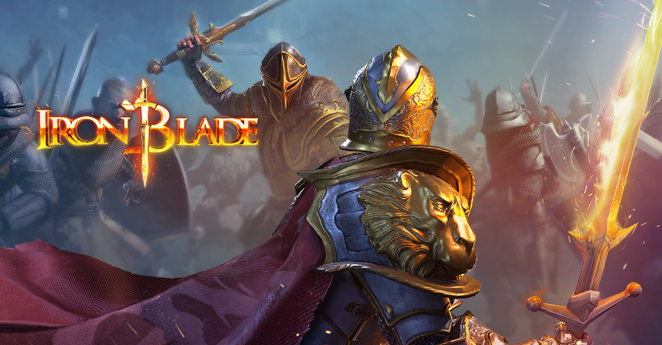
Refining a thrilling A-RPG combat system for touch screens.
Platforms: iOS, Android Publisher: Gameloft
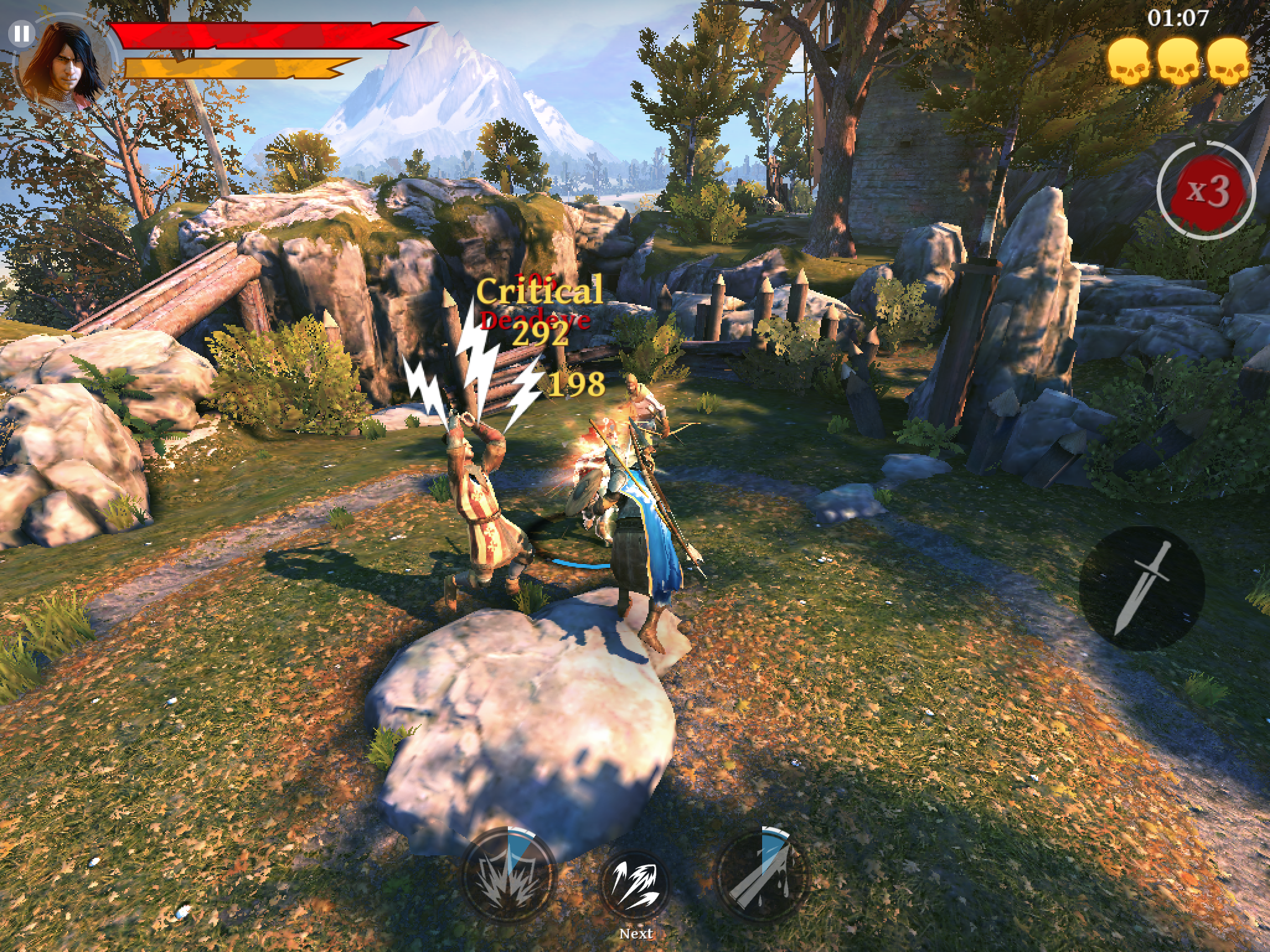
When the game is flowing well, and you’re dancing around your enemies deflecting blows, firing off arrows and smashing bad buys with your shield, you feel like you really are a super-powered knight from an imagined past.
— Gamezebo
🧑💻My Role
- I led a strike team of 4 people at Gameloft HQ, to overhaul the core experience in 2 months.
- We streamlined the experience of swashbuckling action-adventure in a format appropriate for mobile usage, playable in short, frequent sessions.
- We used the inherent strengths of touch screens for inputs (taps, swipes) to improve usability and fun.
- We reworked the long-term progression to distillate major production efforts on a few set-pieces, while managing to keep the same overall narrative, to meet the initial goal of telling an epic fantasy tale set in medieval Europe.

📝 Key Takeaways
- Design handoff to a remote team is a critical step where lots of things can go wrong. Elements can get lost in translation, bruised egos can get in the way. Taking over someone else’s work and handing it back to them is a subtle art.
🤩 Proudest Moments
- Both press and users acknowledged that the innovative combat is the part of the game that stands out the most.
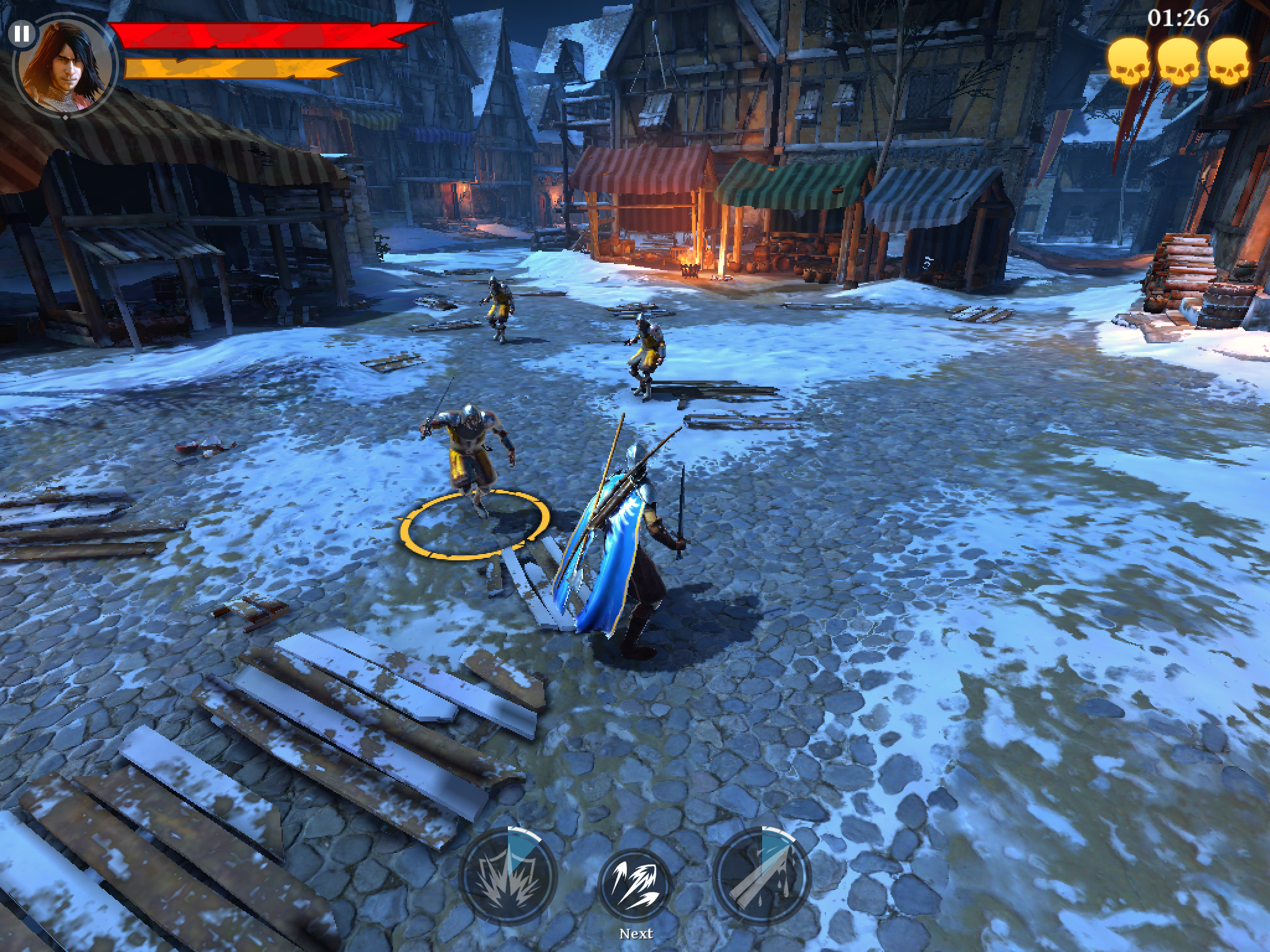
- Creating a free-flowing combat system where your thumb and character move in sync.
- Clearing most of the actionable UI (except for the special skills at the bottom), and making informational UI as contextual as possible, made the game a more cinematic experience, letting the cool setting and high-end graphics shine.
